Making Digital Exploration as Seamless as the Stories Themselves
When explorers get lost in their own digital jungle
Summary
Redesign focusing on navigation visibility, content organization and technical performance
Allowed remarkable stories to take center stage
Increased completion rates
Improved average session duration
When I joined the National Geographic team as Senior UX Designer, I faced a digital paradox. Here was one of the world's most respected content creators, known for transporting viewers to the farthest reaches of our planet, yet their digital platform was preventing that journey from happening.
I wasn't blind to the irony. After years designing digital experiences for millions, I've seen this pattern of exceptional content trapped behind problematic interfaces. This challenge felt personal. National Geographic had inspired my love of exploration since childhood, and now their digital presence was creating obstacles to discovery.
The Invisible Barrier Between Content and Audience
Our initial research revealed something troubling and fixable. Users weren't abandoning the platform due to uninteresting content; they were leaving because they couldn't find it.
"I know there's amazing stuff in here somewhere, but I need a map to find it."
The comment was ironic given National Geographic's history of cartography.
The research revealed three fundamental problems:
1. Content Clarity Issues
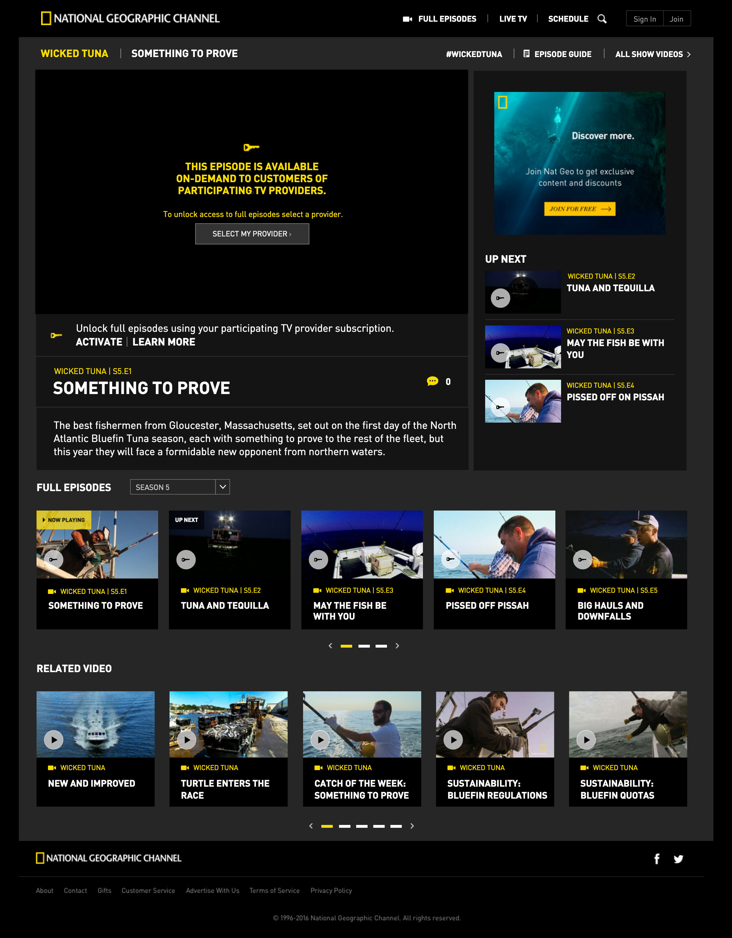
Before clicking, users couldn't distinguish between clips and full episodes, creating a frustrating experience.
2. Navigation Complexity
The path to desired content was inconsistent and unclear. Users developed workarounds; most notably, when lost, they returned to the homepage to restart their journey.
3. Access Friction
Authentication walls appeared unexpectedly during the viewing journey. One user said:
"I finally found what I wanted to watch, clicked play, and then got asked to sign in. At that point, I just gave up."
These weren't minor inconveniences; they undermined the brand promise. National Geographic stands for exploration and discovery, yet their digital experience created frustration instead of interest.
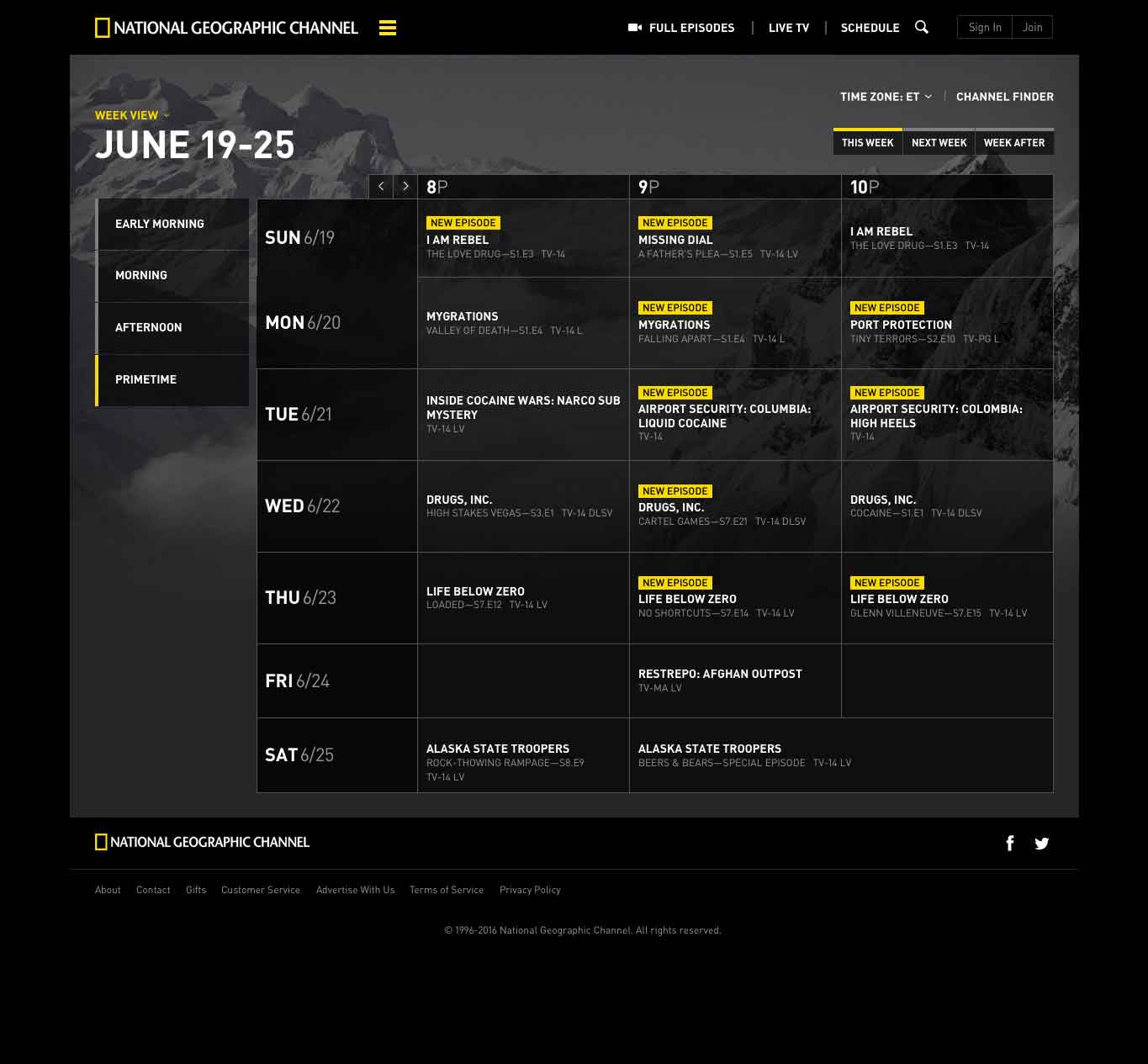
The Invisible Navigation Problem
Most concerning was "navigation blindness." Essential elements remained hidden, with users overlooking the menu icon beside the brand logo. This was not a user failure; it was a design failure.
During a revealing session, a participant spent nearly four minutes scanning a page for navigation before noticing the menu.
This navigation blindness created a series of problems:
- All user types found basic wayfinding difficult.
- Slow page loads and navigation issues
- Users often abandoned video attempts.
The technical performance issues were troubling. We found that 38% of video playback attempts were abandoned before the content began loading after analyzing the data. The platform's technical barriers overshadowed its high-quality content.
The Content Paradox: When More Becomes Less
Every content platform faces a tension between breadth and depth. National Geographic's platform erred too far toward showcasing everything, creating "the paradox of abundance," when offering more delivers diminished value.
Our observation sessions revealed visible scroll fatigue. Users' scrolling pace accelerated down long pages, indicating they scanned rather than engaged. Users frequently lost track of previously viewed content, unable to return to items that initially captured their interest.
The rotating featured stories section created navigation challenges while being visually striking.
"I saw something about tigers a minute ago, but now I can't find it."
This revealed a crucial insight that visual appeal hindered navigation. The platform prioritized aesthetics over functional clarity, a frequent pitfall in design for visually-driven brands.
The Commercial Reality Behind User Experience
No digital transformation happens in isolation, and commercial considerations were part of our equation. Our research revealed unexpected insights about advertising that challenged conventional wisdom.
In an era of ad fatigue, we discovered that users weren't opposed to advertising, but to unpredictable, disruptive ones. They preferred ads in predictable, consistent locations. Clear placement enhanced overall trust in the platform.
"I don't mind ads, I just want to know when they're coming so I can decide whether to watch now or save for later."
This insight helped build internal alignment around our redesign. By demonstrating how improved user experience could support commercial goals, we gained important stakeholder buy-in.
Evidence as the Key Design Tool
Our redesign approach was based on evidence. It combined multiple research methods:
- Qualitative user observation sessions
- Quantitative analysis of navigation patterns
- Interface interaction tracking
- Content consumption metrics
This mixed-methods approach revealed patterns missed through a single research lens. The quantitative data showed users returning to the homepage, but the qualitative sessions revealed why; they used it as a reset when lost.
Interaction tracking showed low engagement with the navigation menu, but observation sessions revealed the cause. Its dark design created visibility issues against the site's aesthetic.
From Insights to Change
We implemented a comprehensive redesign focused on four main areas, armed with these insights:
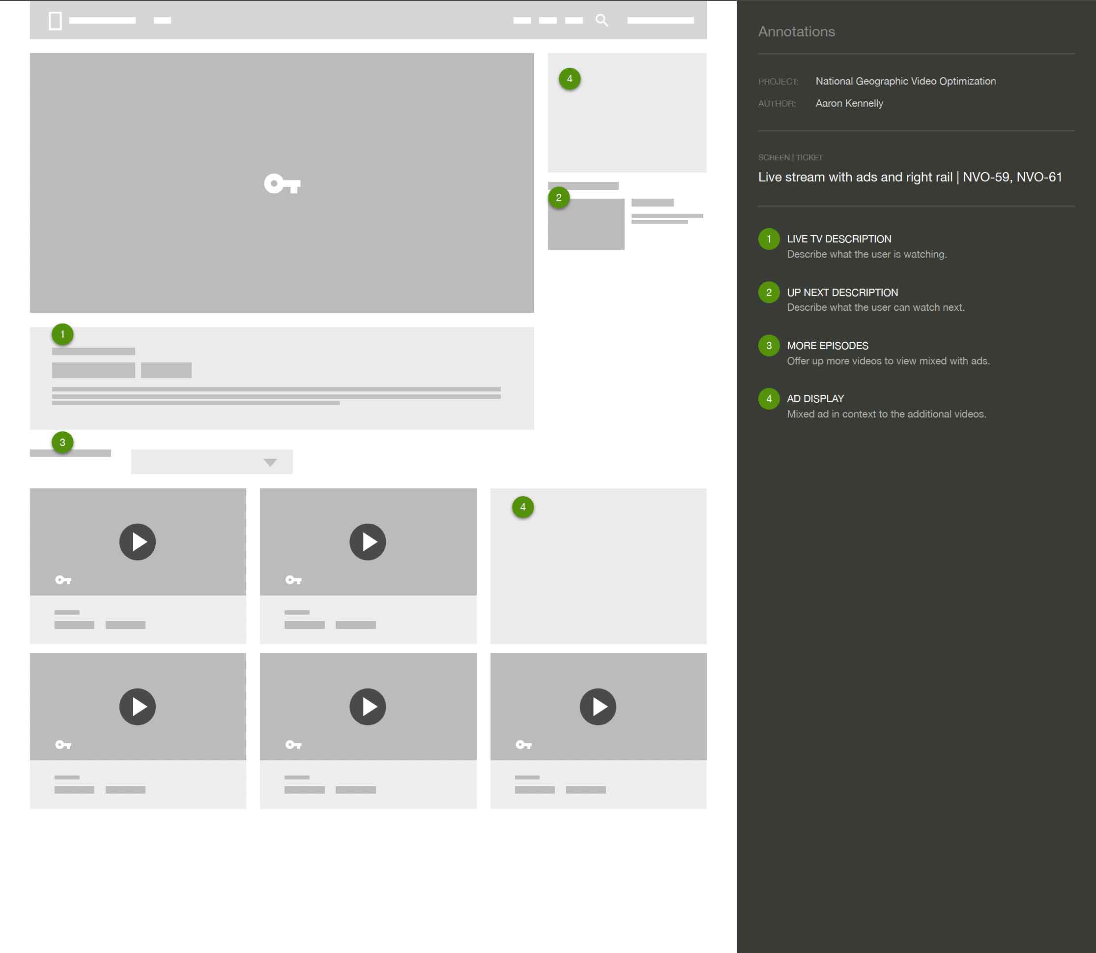
1. Content Organization
We created intuitive category groupings based on user search behavior, not the internal organization. We established clear visual distinctions between clips and full episodes and made authentication requirements clear from the outset.
2. Navigation Improvement
We improved menu visibility through contrast and positioning, streamlined content access by reducing steps, and created consistent navigation patterns.
3. Performance Focus
We collaborated with the engineering team to optimize video delivery, improve load times, and enhance browsing speed, recognizing that technical performance is important to user experience.
4. Subscription Journey
We designed a more effective conversion funnel for paid subscriptions that felt like a seamless extension of the exploration experience by reducing friction and clarifying the value proposition throughout the user journey.


When your interface becomes invisible, exploration begins
When Design Disappears
The true measure of successful experience design is its invisibility. When users stop noticing the interface and engage with the content, we have done our job well.
Post-launch metrics validated our approach. Video completion rates increased and average session duration improved.
Lessons Beyond National Geographic
This project reinforced principles that apply outside this case:
1. User behavior reveals more than expectations.
Our initial hypotheses about user challenges were partially correct. We uncovered the true issues by observing actual behavior.
2. Simple changes often have significant impacts.
Some of our most effective improvements were simple adjustments to contrast, positioning, and labeling.
3. Technical performance directly impacts engagement.
No design polish can overcome slow load times and playback problems.
4. Content organization must align with natural exploration patterns.
The most elegant information architecture aligns with how users think and search for content.
The platform continues to evolve, guided by user feedback and observation. At National Geographic, and in all digital experiences, the discovery journey is as engaging as the end point.
Reflecting on this project, I'm reminded that digital design doesn't just remove barriers; it creates possibilities. By making the interface recede into the background, we allow the content to take center stage. And when that content is as remarkable as National Geographic's, that's where it belongs.